


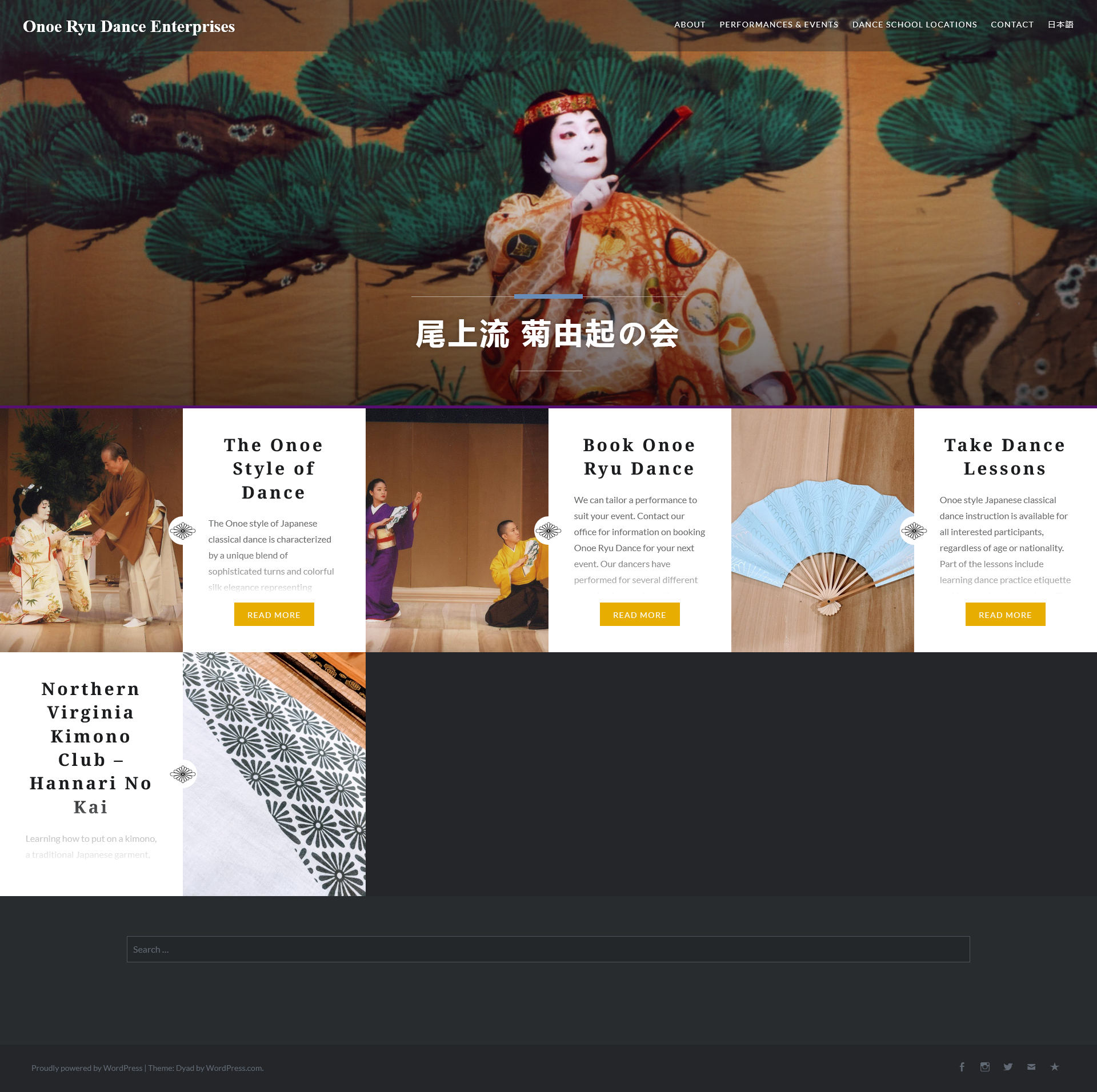
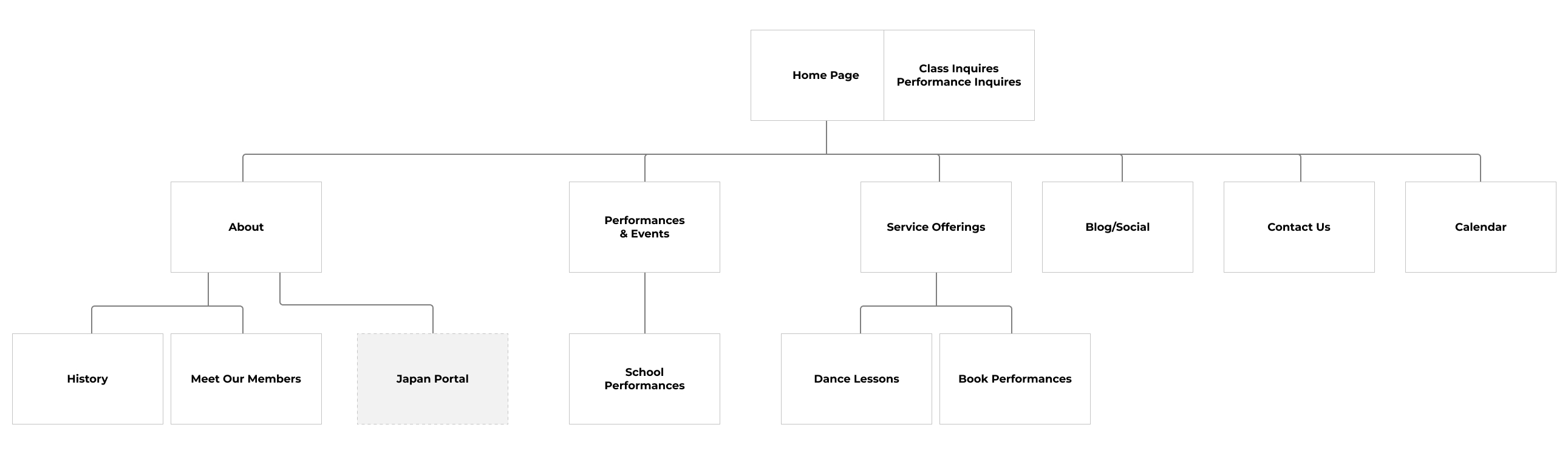
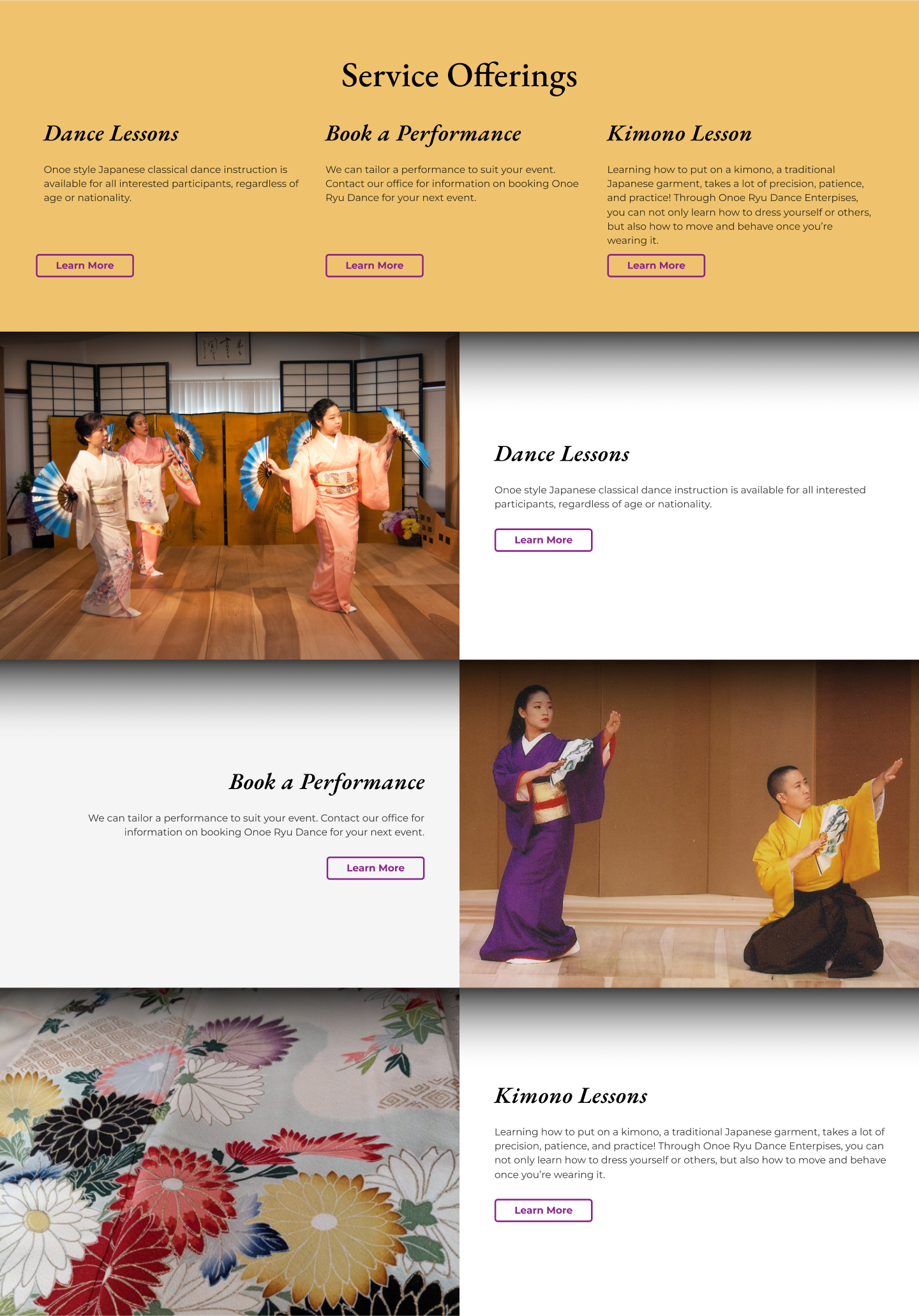
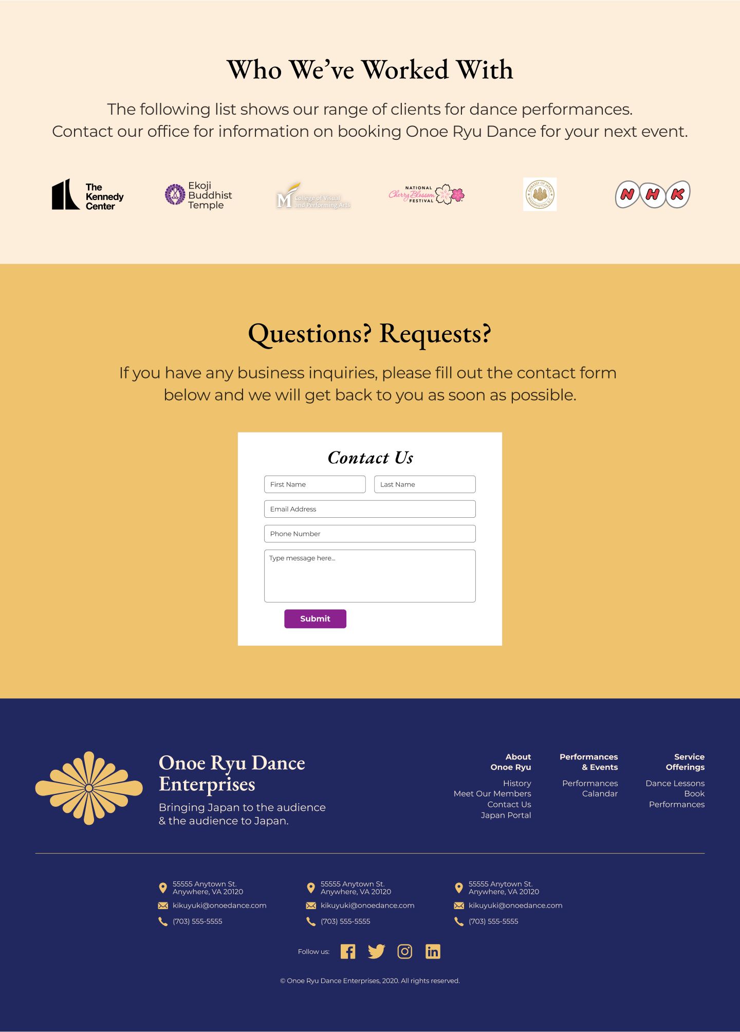
Improve User Experience
Have key information directly on the homepage.
Establish Clear Calls to Action
Guide users toward inquiries, lessons, and event participation.
Establish Brand Identity
Define a cohesive visual language (colors, fonts, imagery) that reflects the elegance and tradition of Onoe Ryu.


Please reach out if you have any questions or comments you'd like to discuss.
I'm currently available for consultation, freelance, and full-time work.
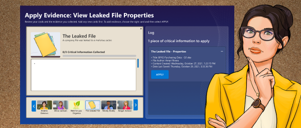
A story-driven simulation designed to help professionals practice cloud security skills through a gamified experience.
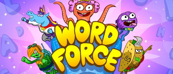
A redesign to help young learners build reading skills through play, backed by research and testing.
