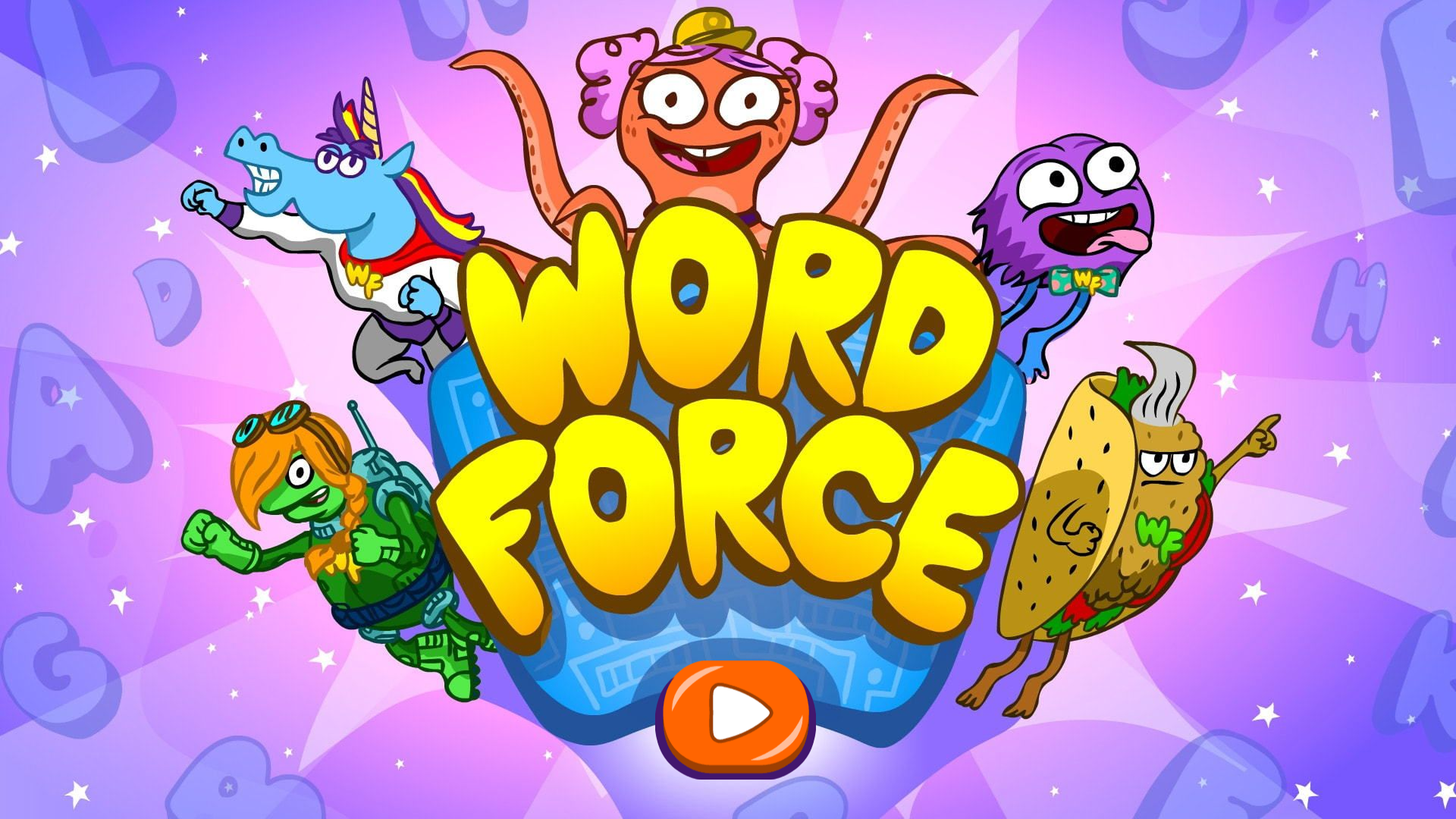
Project Launch
After six months of collaborative work, WORD Force version 2.0 launched with a stronger design, clearer educational flow, and more engaging gameplay.
Key results included:
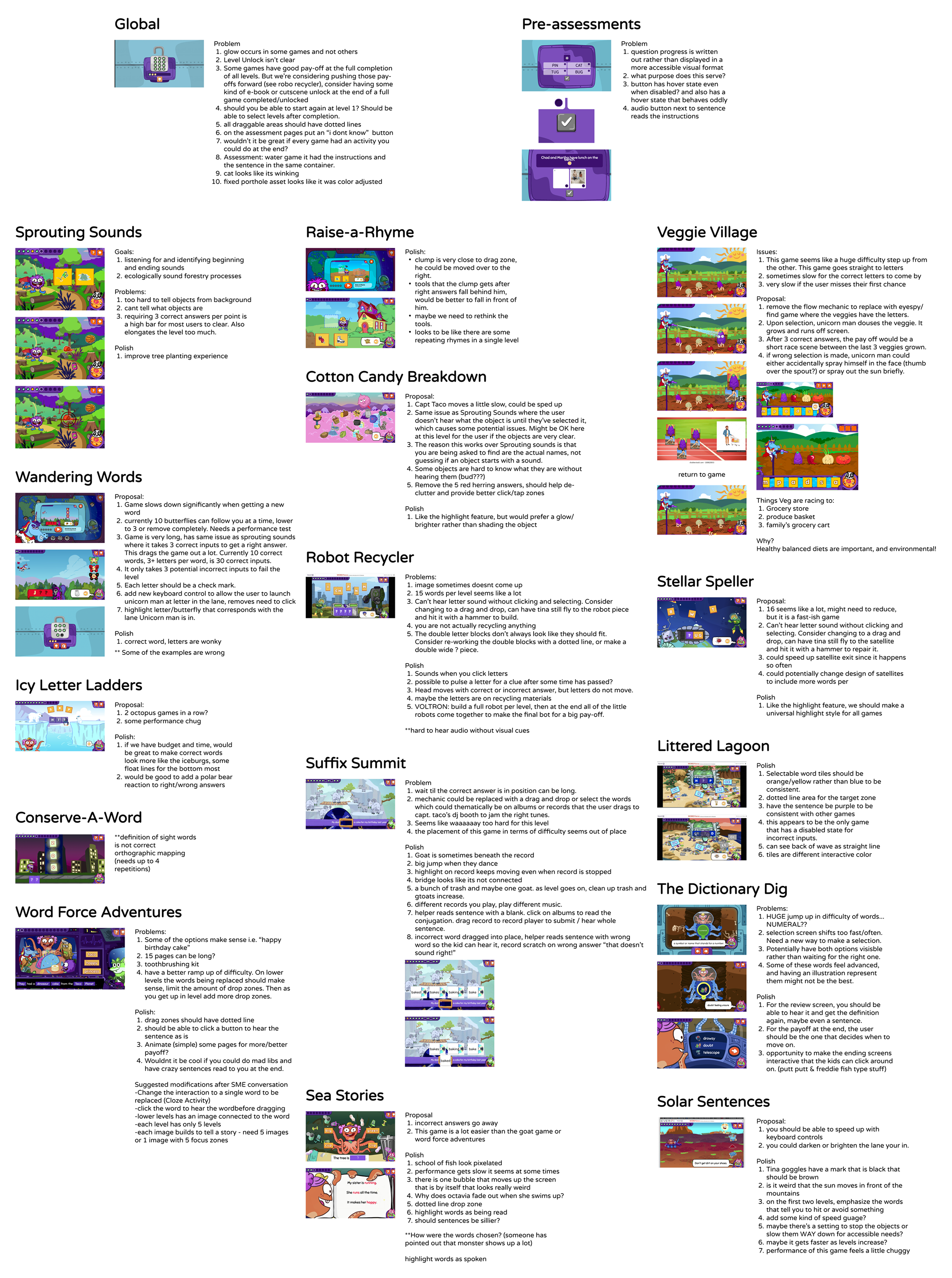
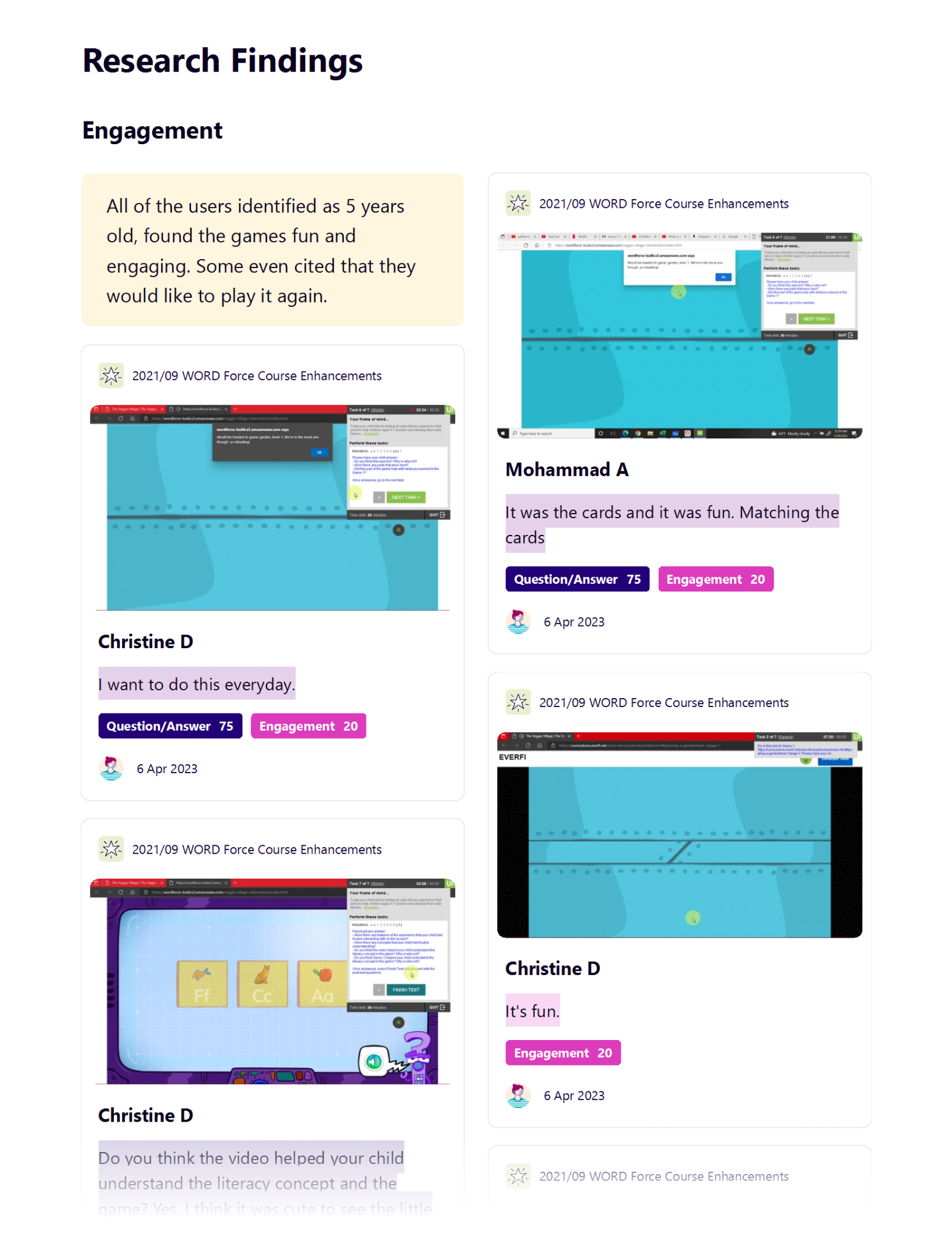
• Higher Engagement: Children played longer and returned more often compared to version 1.0
• Less Pain Points: More intuitive understanding of the games and less frustration with understanding the learning objectives or how to play.
• Better UI: Easier time with the mouse controls, especially for the younger children.
• Better Learning Support: Interventions and videos improved comprehension for struggling readers.
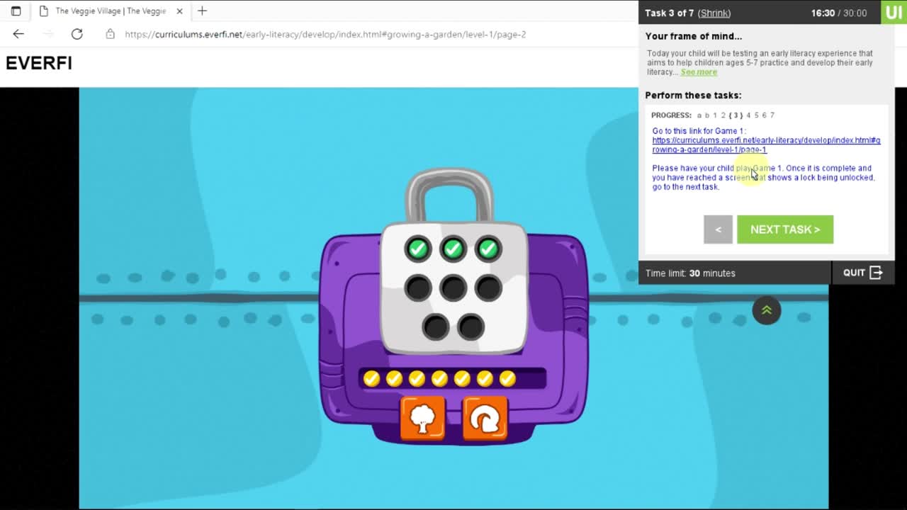
• New Testing Methodologies: Successfully ran large-scale usability tests with a very young audience.
• Team Insights: Learned how accessibility needs shift dramatically between ages 4 and 7, and how flexible processes are key in kid-centered design.
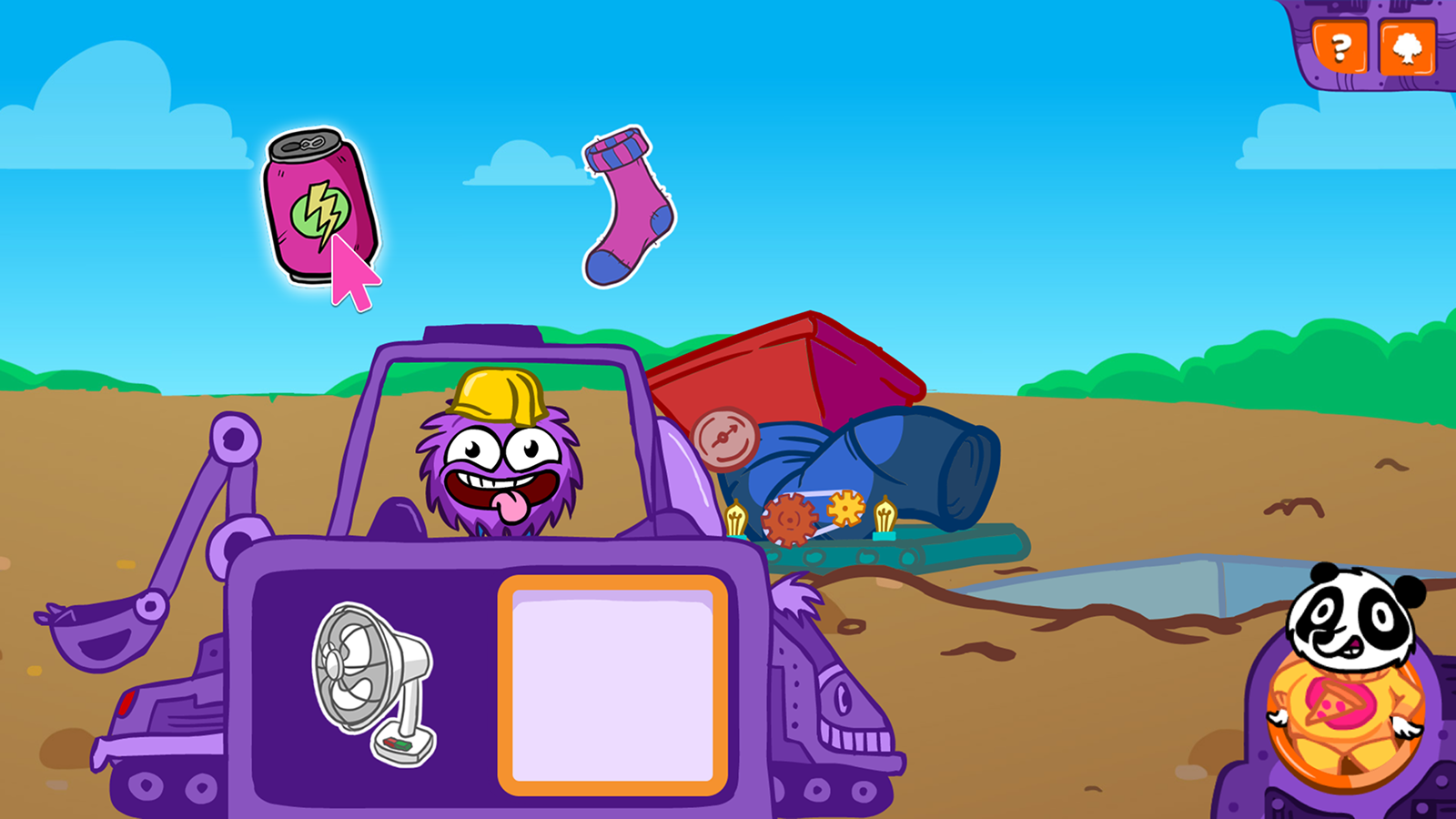
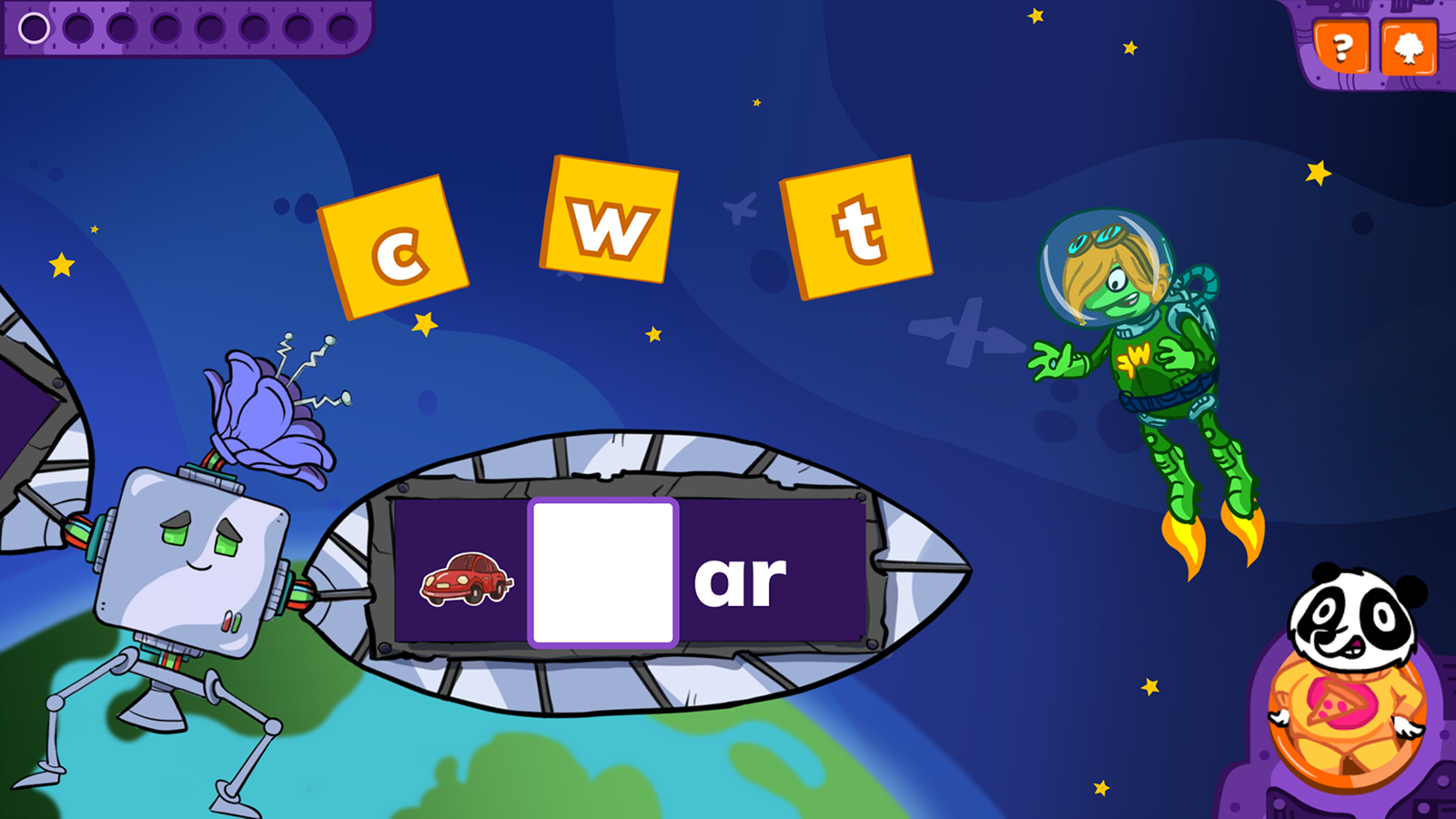
The new science-backed interventions and tutorial videos introduced made reading concepts clearer and supported struggling readers more effectively—a core goal of the redesign.
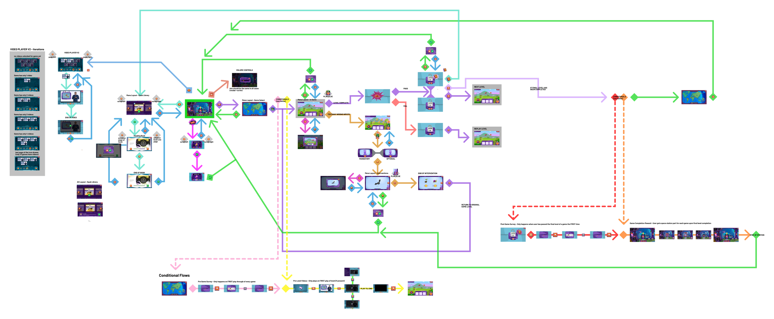
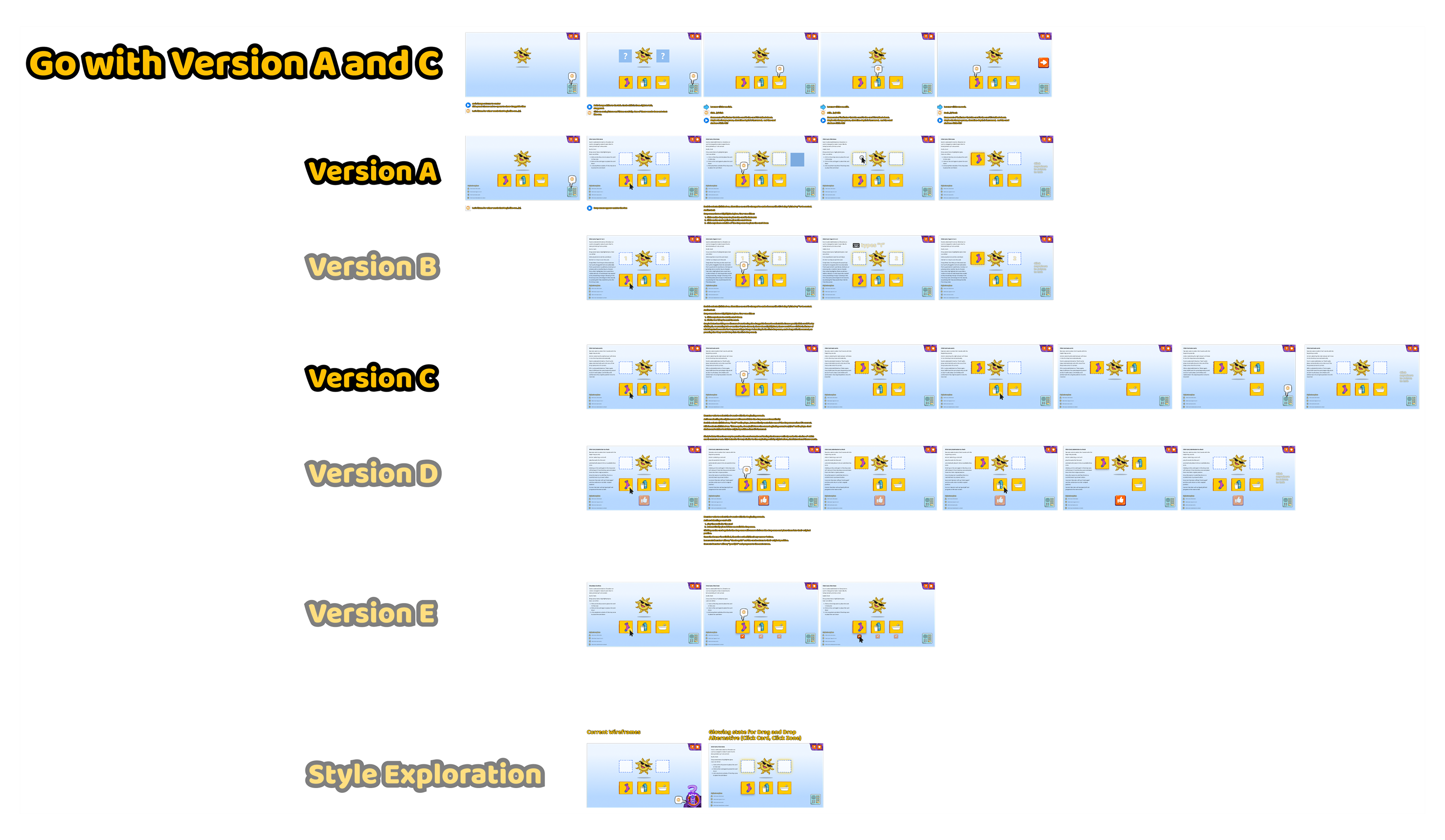
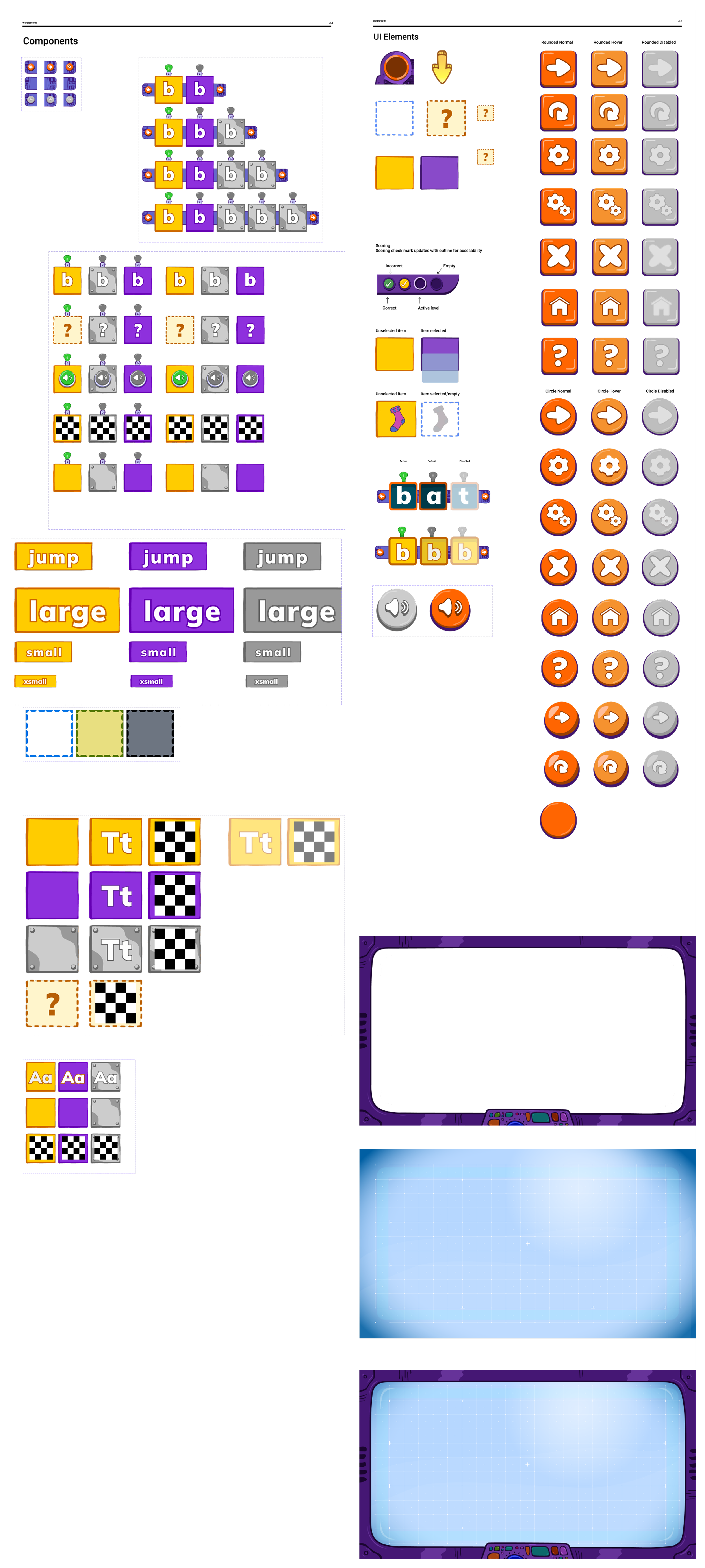
From a design systems standpoint, expanding the component library and standardizing UI elements ensured visual coherence across all 15 games. This also laid a scalable foundation for future updates or feature additions.
On a personal note, I learned how UX design for children requires flexibility, empathy, and continual adaptation. Testing with very young users was eye-opening. I learned how different accessibility needs can vary within even a one-year age gap, and how intentional design tweaks—from animation pacing to button size—can make or break a child’s experience.
WORD Force 2.0 demonstrates how thoughtful UX, evidence-based learning strategies, and rigorous testing can transform an educational game into a tool that both delights children and supports literacy growth.